Wednesday 10 December 2014

A Christmas Bauble

Hello everyone.  Yes, I have finally managed to find my way back to my blog.  It has been neglected lately, and here we are in the middle of December with so much still to do.  Other than more crafty goodies, one of the best things Santa could put in my stocking would be more time!  I daresay that many of you feel the same.

This is my entry for this months Claritystamp challenge, which has the theme of "Trees."  In keeping with the season, I've decided to make a very simple little Christmas project.

Firstly I drew round the outline of my template, then slowly began building up the colour using Faded Jeans Distress Ink with a stencil brush, gently working round and round.  You can see below how it starts out light and gradually builds in intensity.


Then I cut out the circle and added even more depth of colour around the edge with the same ink using a mini blending tool.

 
The next step was to create some snow.  This is quite a simple effect to achieve, just flicking water at the artwork and blotting with paper towel.  As you can see, although the technique is easy, it is a bit more difficult to control;  and I have created a blizzard!
 
 
To complete this piece, I used Jo Rice's trick of soaking the mini blending tool with water to lift the ink and make a full moon (Thanks Jo!), then stamped the carol onto shrink plastic, and glued into place once I had shrunk it down. 
 
 
Now it was time to start work on the artwork for the other side.  I brushed Faded Jeans Distress Ink about half way round for the sky.  Using only Olive Archival Ink, I sponged through the Treescape Mask to create a backdrop, then using first, second and third generation ink with the trees from the Bleak Midwinter set I completed the forest before cutting out.
 
 
The two pieces of artwork were then stuck together back to back.
 
 
I then assembled the bauble, adding a few sequin snowflakes to create a shaker effect.  My first intention had been to use some polystyrene beads, but the static kept making these stick to the sides of the bauble, so I had to have a little rethink and move to plan B.


Apologies for the quality of the photos;  the finished bauble was difficult to photograph.  If you have time, please leave a comment;  I'd love to know what you think.  Wishing you all a very Happy Christmas and many blessings for the New Year.  In spite of all my good intentions, it will probably be 2015 before I get round to blogging again.  Till next time, next year!  Xxx


Saturday 18 October 2014

Seasons

Hello again.  This is my project for this months Claritystamp challenge:  the theme is the seasons, and I have chosen autumn.  I have to say a huge thank you to Maria Simms, as I found this months workshop at Shrewsbury inspirational, and after a few very hectic weeks at work, feel that my creative juices are finally starting to flow again.  Another highlight of the last few weeks was being able to go to Port Sunlight for the first time;  what a fab event.

I used my new 8" x 10" Gelli Plate to pull a simple background print using Buff Titanium acrylic paint and some scrunched up copy paper.


Then I used Potting Soil archival ink to randomly stamp one of the funky leaves all over the background.

 
Then I masked off all the leaves, and used my stencil brushes with Distress Inks in the following colours:  Squeezed Lemonade, Wild Honey, Barn Door and Peeled Paint to randomly colour the background.
 
 
This was then used to cover a wooden wreath and the edges blended with a little Vintage Photo distress ink.
 
 
I the meantime, I set up a production line stamping and colouring more funky leaves in the same colours, also adding some extra shade and definition by using the corresponding colour of distress marker.
 
 
All that was left to do now was to arrange and glue the leaves into place.  I also decided to add a couple of twigs and fir cones.
 
 
I had great fun making this, so I hope you like it.  (And I have some leaves left over, so watch this space!)  If you're still reading, I hope you'll take the time to leave a comment, I'd love to hear what you think.  Looking forward to seeing all the other entries this month.  Good luck everyone.  Till next time.  Xxx


Sunday 28 September 2014

My take on Nature

Hello everyone.  Its a beautiful sunny Sunday morning, but its nearly the end of September, so I just have to make time to blog my card for this month's Claritystamp challenge.


The background was done on watercolour paper using Brushos.  I got the paper very wet, and as well as sprinkling on the Brusho crystals, I also sprinkled on some rock salt.  This moves the colours around and can be brushed off when the piece is completely dry.

 
I then stamped the fish and seaweed into place using Black Archival.  When this was dry, I removed a bit of the colour on the fish by loosening with water and blotting with kitchen towel.  I could then colour in the fish using my Spectrum Noir pencils.
 
 
I added a little colour to the weeds, and highlighted with Glossy accents and a tiny bit of glitter.  Patience is needed for this step, it takes ages to dry!
 
 
I trimmed it back just a little and matted onto some co-ordinating colours.
 
 
I'm really looking forward to playing again with my Brushos and mastering some different techniques.  In the meantime, I hope you like this.  There are loads of beautiful entries again this month;  good luck everyone.  Till next time.  Xxx


Sunday 31 August 2014

A Feminine Card

Hello Everyone.  I seem to have almost forgotten about my blog during these last few weeks.  Note to self:  must try harder!!  This card is my entry (last minute, I know) for this months Claritystamp challenge.

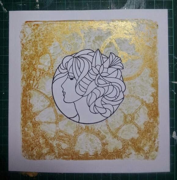
First, I stamped Madeleine into the centre of a piece of gelli card using black Archival ink.  I masked her off before pulling a background gelli print using buff titanium acrylic paint.

 
I kept her masked off while I pulled another print using gold acrylic and the cogs stencil.
 
 
I masked off Madeleine again, and used make-up sponges to smear colour into the background.  I used stream and wild plum Adirondack inks, and wild honey Distress ink.
 
 
Then I coloured in Madeleine with Spectrum Noir pencils and trimmed the artwork back.  Here you can also see that I have added colour to the paper I used to blot when pulling my gelli prints.  I think this could work in the background.
 
 
In addition, I also brushed the same colours through the same stencil onto a plain white card blank.
 
 
Now it was just a case of mounting everything.  I used charcoal to define some of the cogs and to create a bit of shadow around Madeleine and added "Inspire" from the word chains.
 
 
My other half doesn't quite get this design, he can't see why the cogs should have such a prominent place on a feminine card.  I have to say that this feels a bit like me:  there is so much going on at the moment, the wheels inside my head never seem to stop turning!
 
Hope you like it.. I'd love it if you could take time to leave a comment.  Good luck to everyone else in the challenge.  Till next time.  Xxx


Saturday 2 August 2014

A wedding card for Simon and Dawn

Hello to you all.  This is another project I can share with you now that the occasion has passed.  I hope that Simon and Dawn will enjoy a lifetime of happiness together.


I taped the oval shape stencil onto a piece of gelli card and dusted very lightly with Tumbled Glass distress ink using my stencil brushes.  Leaving the oval stencil in place, I taped over the Leafy Swirl stencil and added a bit more colour.

 
Then I added some Stream Adirondack around the edges of the oval.  Now I could remove both stencils.
 
 
I stamped the lovebirds into the centre of the oval using Black archival.
 
 
After practising on some scrap paper, I extended the perch for the lovebirds and added a couple of strings for it to hang from.  Then I coloured them using my spectrum noir pencils.
 
 
Finally I used the plain banners to frame the oval with a personalised message (this needed some practice on scrap paper too), matted it onto two shades of co-ordinating card, and added a couple of pearls to the photo corners (stamped using Black archival and embossed with clear powder) from the journaling set.
 
 
Thanks for stopping by.  I hope you like it.  If you have time, I'd really like to know what you think.  I appreciate all your comments;  they are a real source of encouragement for my crafting journey.  Till next time.  Xxx 


Sunday 27 July 2014

Happy 1st Birthday to our Grandson Stanley

Hello again.  It seems ages since I last blogged, but as many of you know already, I have recently started a new job, so that has been taking up a lot of my time.  I do have a couple of projects that I will be able to share with you over the coming weeks.  This card will be my entry for this months Claritystamp Challenge. 

Using the abstract squares stencil, I used my stencil brush with Tumbled Glass distress ink to create first a very delicate sky above the rainbow with some clouds added using a Clarity mask.  Below the rainbow, I made the sky a bit stronger and flicked some water at it, and blotted, to create some raindrops.  I blended Barn Door distress ink, Butterscotch and Stream Adirondacks, and finally Dusty Concord distress ink for the rainbow.  Lettuce Adirondack was used for the ground.

 
Ready for the stamping.  This was mainly done in Archival Black, with a little Watering Can Archival too.  The figure is taken from the Wheelie Men & Boys stencil, and I masked off the letters I needed from the Word Chains to spell out Stanley's name. 
 
 
Now to create the surprise.  I had already decided which squares I would use for my "windows"
 
To help position the photos accurately on the underneath layer, I traced round the outline of the squares before gluing the photos into position. 
 
 
The 2 layers were then stuck carefully together, the artwork edged in black and simply mounted onto an 8" x 8" white card blank.


I hope you like it.  It was certainly well received!  I'm hoping it won't be as long till next time.  Xxx


Sunday 6 July 2014

Thank you cards

Hello again.  I've enjoyed a lovely weekend's crafting, and want to share a couple of thank you cards I've made using the Claritystamp garden heart, "kind hearts" verse and a sentiment from the word chains, along with the abstract squares and trellis stencils.

I used my stencil brushes to add colour through the abstract squares stencil.


Ready for the stamping.
 
 
I masked off each square in turn using post-its and stamped sections of the garden heart through the apertures. 
 
 
I wanted to add each line of the sentiment separately, so used post-its again to cover up the other lines of the verse when inking up the stamp.
 
 
All that was left to do was to colour in the design using my spectrum noir pencils.
 
 
I then made a smaller tag card with the same theme.  The only thing I did differently was to add a little embossing paste through the trellis stencil as well.
 
 
The finished cards.
 
 
I really enjoyed making these cards.  I hope you like them too.  Till next time.  Xxx


Thursday 3 July 2014

Happy Anniversary to my Sister and Brother-in-law

This card has been made for a little while, but I am only just able to share it with you.  It is my own spin on one of Barbara Gray's projects.

 
It was very simple to make;  I brushed ink through the family tree stencil from Claritystamp, then added definition to the trunk and branches with promarkers.  I then cut out apertures, behind which I mounted some photos of Christine and Ian's wedding day.  I finished with a die-cut tag and Claritystamp word chain sentiment tied with a ribbon.  This was all simply matted onto some dark brown card. 
 
I hope it will bring back many special memories of their wedding day.  I certainly enjoyed making it.  If you have taken time to have a look, I would love to hear what you think.  Till next time.  Xxx


Wednesday 25 June 2014

Claritystamp challenge - Masculine

Hello to you all.  Its been a while I know;  I've had a lot going on recently, and have to admit that I've been struggling to find my mojo during the last couple of weeks.  Still here is my effort for this months challenge.

 
I created what I hope is a card that would be suitable for a man taking up a new job that requires a lot of travelling.  Although the stamping of the British Isles is a bit uneven, I don't think this spoils the overall effect.  The remainder of the stamping is all done in black Archival, even the photo corners which are from the journaling set, and were clear embossed, before being attached with foam pads to add a bit of dimension.  The hot air balloons were coloured with Distress Markers and I did a bit of zentangle in the same colours to add interest and detail.  I added a couple of metal pointers to the compass.
 
I'm off to chase my mojo.  Maybe it is floating away in one of those hot air balloons...
 
Good luck to everyone.  Till next time.  Xxx